Everything you’ll ever need to secure your app from every possible threat
Checklist
The mobile ecosystem may be crowded with apps, but it’s far from saturated. If you build a truly useful app, there is still plenty of room for you. The competition is undoubtedly high and you need to develop a high-performance app that delivers quick and consistent solutions to problems your target audience grapples with. While you’re at it, it’s a good idea to solve these problems keeping your app looking beautiful and working like a charm. Your app must have a spectacular user interface (UI) and impressive user experience (UX). So much so that a sub-par UI may be the reason your app could be rejected by app stores.
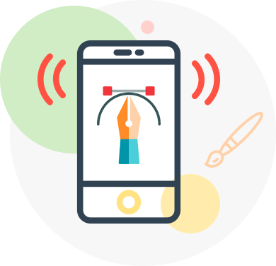
A good UI is the key to an app’s success. Steve Jobs famously said,
and we couldn’t agree more. An app with a good design doesn’t just mean an app that looks good but really, an app that delivers the results it promises in a smooth, seamless manner, guiding the user from one step to another with ease and reaching the destination, be it a sale, conversion, sign-up or download, without overwhelming the user.
Apps that overwhelm users with puzzling navigation, cognitive overload and unfriendly design are less likely to stand out in the crowd. Localytics reports that 23% apps get used only once. This means that one in every four apps is being uninstalled after single use. An abandonment rate this high indicates that mobile app design and UI need to improve by leaps and bounds.
If you are contemplating building an app for your business, you’ve come to the right place. We have compiled a detailed dossier of all the mobile app design principles and best practices you can follow to make your app deliver the sleekest, most efficient user experience, and keep them coming back every time they need a service you offer.
A good on-boarding workflow is essentially a user’s first impression of your app and lays the stonework for app adoption.
When done well, a good on-boarding flow establishes a strong relationship between users and your app. The idea is to
quickly get them tostart using your app and seeing its benefits.
Users have freshly downloaded your app and expect that it will solve an immediate problem. This is where you tell users exactly what your app will do for them and how it will make their life more convenient. This is not the time to flaunt fancy features your app has. Instead, focus on the core value.
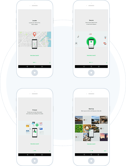
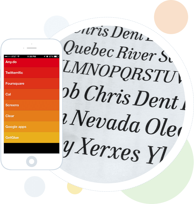
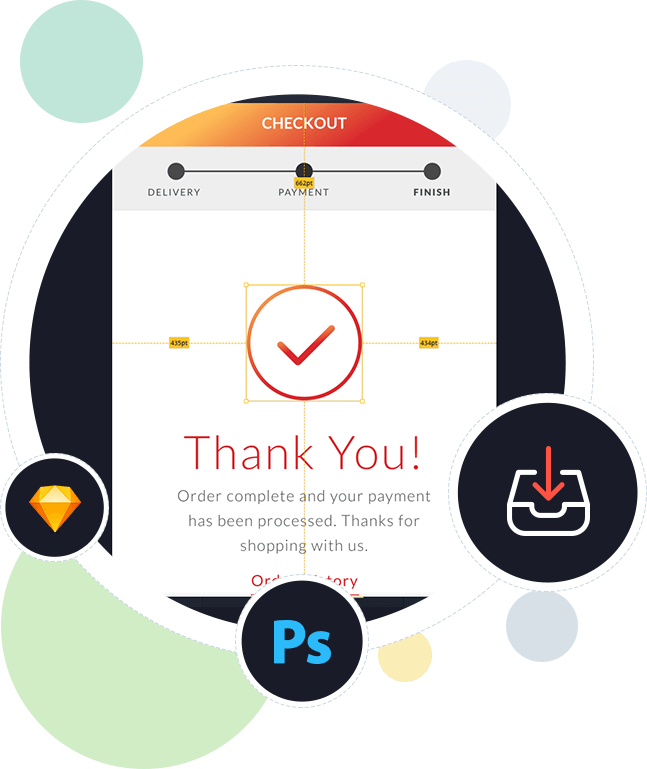
Here’s an example from Lookout, a mobile security app. It has a crisp and simplified on-boarding flow. The very first screen that opens up clearly states what this app will do for you, and the next four screens show the four key ways in which it will do so.
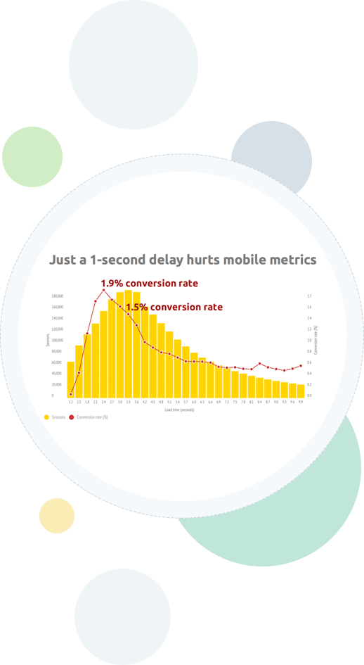
Users demand immediacy and have no patience for an app that takes forever to load, and when we say forever, we mean anything north of a few seconds could get your app abandoned.
With internet speeds improving, users want results quickly and because there are so many apps out there, users will quickly move to an app that provides instant results. For your app to remain on the user’s device, you need to adopt measures that keep loading times in check. If you go by the PageSpeed Insights blog on the Google Developer website, keeping page loading time under one second is the gold standard now. Achieving this target is quite a lofty task we agree, as it takes about that much time just to make contact and deliver data to the server. However, these are some of the ways you can try to limit the loading time.
Of course, an app needs to get the user registered in order to provide a customized experience and increase conversions. However, it is a step that needs a rather careful approach.
Forcing a user to provide personal information immediately after opening your app leads to discomfort and distraction. Users fear that sharing their email will lead to an onslaught of marketing emails. The user downloaded your app with the aim to browse, buy, book or find information about something. Cater to these expectations first. The user needs to trust that your app will solve his/her problem, before providing any personal details. It is a good idea to allow your user to take a tour and experience the app for a little while and then gently remind them to sign up after that.
Also, filling a signup form raises the possibilities of errors, unmatched passwords and various other hassles that could potentially drive the user away. Apps that won’t move forward unless email and password are provided are likely to be dropped for an alternate app. Apps that ask for too many details, have a complex password authentication process or are difficult to get by in any other way often fail to get a user on-board successfully.

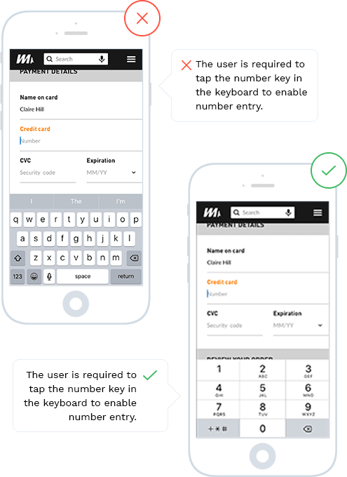
Typing on mobile isn’t entirely comfortable and is often error-prone. It is, therefore, a good idea to keep the typing requirements to a minimum. Keep forms simple with only the bare essential information asked and use auto-complete wherever applicable. It is also a good idea to customize the keyboard with the type of query. This means displaying a numeric keyboard when asking for pin, showing a search button in place of enter when searching, and including ‘@’ and ‘.com’ buttons when asking for email IDs.
Once the user is successfully on-boarded, it’s time to get to work. Good navigation is the basic element of a great user experience. Every action or piece of information should be easily communicated and executed.
Too many options to choose from, too many questions to answer, or too much information to read and understand are all instances that increase cognitive load on a user. The user shouldn’t need to undergo an education to be able to use your app. People use apps to make their lives simpler. Cognitive load, when using the app, defeats that purpose. Your app should show what needs to be done next with the help of intuitive graphics instead of telling it with blocks of text.
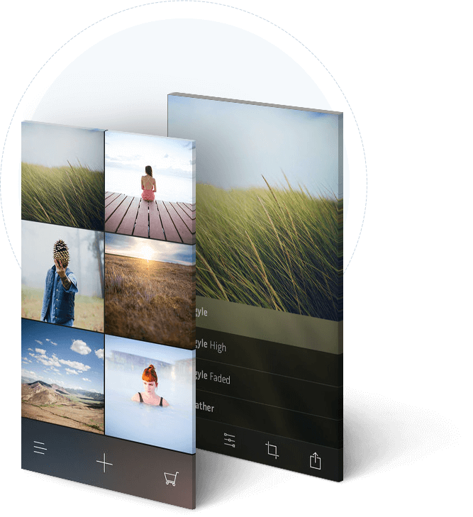
Photo editing app, Litley keeps a minimal design, allowing for a smooth and pleasant photo editing experience on the app.
Effective app design entails that the UI be easy enough for even a five-year-old to navigate. Reduce cognitive load on your users by adopting minimal design that includes only the most essential elements. Refrain from flashy design and use soft subtle animation where required.
If you have been interacting with users on a website and are just launching a mobile app, make sure that you keep the UI consistent on both channels. Users accustomed to a certain interface may be confused when they see a whole new color palette or different language and terminology on the app.
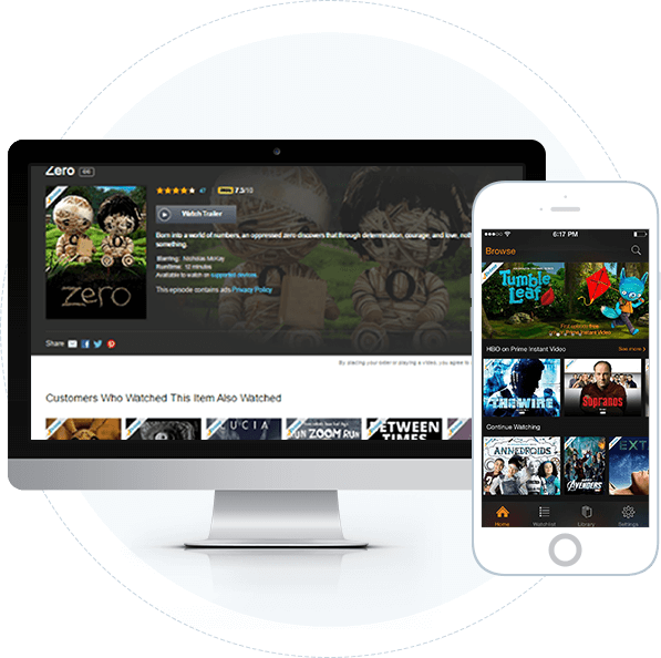
The look and feel of movie and video selections page[PAGES?] on the Amazon website and on the Amazon app are similar, allowing users to seamlessly use either one as they like.
Makers of successful apps may find this hard to believe, but there are apps that make it exceedingly frustrating for the user to take a step back. Clicking on the back button takes users all the way back to the homepage. Sometimes, clicking on the back button does absolutely nothing and at other times, there is no back button at all.
A good app allows a user to go back and make corrections, take a second look or choose another option in one click, and then proceed with ease.
It is also crucial to pay attention to the placing of the back button. iOS apps have this on the top left of screen and Android apps have the standard ‘Go Back’ button. Don’t make the user search for it.
As mundane as they may seem, tap buttons are a very important element of mobile app design. You must consider the smaller screen size and the finger as the primary mediums of tap. Buttons that are too small and too closely packed are difficult to tap with the finger tip and very error-prone. If users end up tapping the adjacent button over and over again, it can be frustrating. Things are a little easier when a desktop is being used and a mouse pointer is available to do a precise job, but for fingers, stay on the side of safety and design your buttons large enough and with enough padding space.
An average tap with a finger spans 14mm-15mm. So that’s a good rule to stick to when designing buttons. Padding space is the empty space around the button that will prevent the adjacent button from being activated in case of slight misplacement of finger. Padding also helps your UI feel spacious and tidy instead of cluttered.
It’s easy to want to experiment and get artistic with fonts. However, users greatly prefer an app with clear, easy-to-read font. Try to keep your font size upwards of 11 point as anything below that will strain readers’ eyes. Also carefully optimize line spacing, paragraph breaks and indentations so that the text throughout the app is consistent, coherent and easy to scan through.
As elegant and pretty the font in the image on left may be, it’s hardly something you’d want to see when trying to order food online. It is wiser to stick to simpler, less flowery, but more readable font like the one in the image on the right.
Make sure there is plenty of contrast between the font and the background for easy readability. Light-colored fonts may look aesthetically appealing, but make it very difficult to read, especially against a light background. Optimum contrast is central to easy readability. High contrast is also very helpful when the user is outdoors and bright light makes the screen look dull.
How often have you seen pages with dark backgrounds and flashy, bright, sometimes multicoloured fonts? Something like that is hardly going to appeal to your users. Dark background with light text is generally not a good idea and gives the impression of having been designed by an amateur designer obsessed with color.
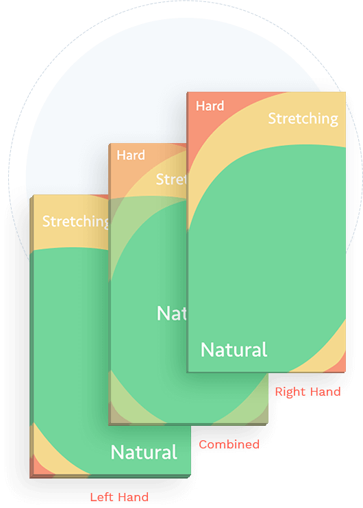
When designing for mobile phone, it is essential to pay attention to one-hand-navigation and thumb-friendly zones. Using the thumb for navigation is almost universal. With screens getting bigger and thumbs, well, not, it is important to optimize your screen’s real estate in a way that makes navigation easy with one hand.
Place the most important and frequently used icons and buttons in the green zone of thumb accessibility. The less-used buttons can be placed in the yellow zone and it’s a good idea to avoid placing any in the red zone. If a user has to strain his thumb or use the other hand just to click an icon placed somewhere in the corner, it’s less likely that he will put up with that app for too long.
An icon is often the first thing users notice about your app in the app store. It is a huge part of your branding and goes a long way in making the right first impression. That is why a great deal of thought and caution must go into designing the perfect icon.
Ever since the very first computer came into existence, icons have been the primary pint of UI. In the early 80’s, icons were only black and white outlines in a grid, and slowly they began to take on color, form and dimension. Today, we have an abundance of richly designed, highly graphic and realistic icons. Here is a super-interesting piece about the history and evolution of icons.
Today, with over 2 million apps competing for attention, making your icon stand out from the crowd and try to represent your app in less than a square centimetre of space is a monumental task. However, with the right guidelines, you can create a truly distinct and memorable icon.
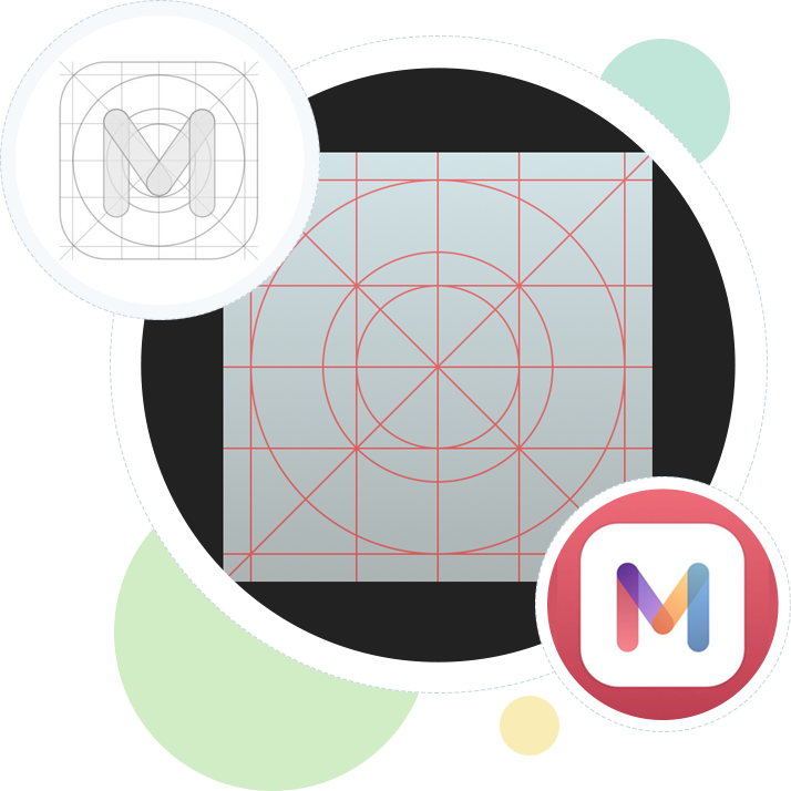
First of all, it is important to create an icon of the right size. While the app store will display the full icon, the push notifications will display a smaller version of it. Your icon must be such that it stands out no matter how small the display.
Refer the image below to get an idea of how your icon should be designed. The distinct, primary focal point of your icon design must lie in the innermost circle and the outer edge of the square should be left blank or have minimal design. This way, even in the smallest display, the icon should clearly render itself. The outer edge may be cut off from the display in many cases, so keeping it empty will prevent crucial elements of your design from being cropped out.
Trying to squeeze an entire scene in a square centimetre is seldom a good idea. Stick to just one central idea that represents your app and make that your icon using a minimal, clean design. You could use a background to enhance the readability of your icons, or do without it if your icon itself is bold and distinctive enough. The Tinder icon for example, works well even without a background.

A lot of services that apps provide are location-based and hence, it is a good idea to enable current location detection. For food delivery, restaurant, bank or store finder apps and a number of similar ones, detecting the user’s location and guiding them from there to the desired destination is essential. It is quite obvious when a user is asking for directions to a certain place, that you take his current location as the starting point. The user shouldn’t have to enter his zip code or location to get a map. A lot of times, the user may not even know where he is currently and is probably depending on the app to help him out. So auto-detecting the current location should be a default setting.
In many cases, however, users may want to find information in relation to a different location. Sometimes, they may be planning for a trip ahead and may desire to know how to get from point B to point C while they are currently at point A. This is why the option to change the current location to point B must be included. An app that does a good job of auto detecting the current location, but doesn’t provide a way to change it can be difficult to navigate.
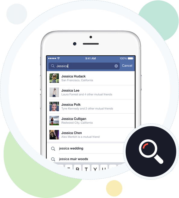
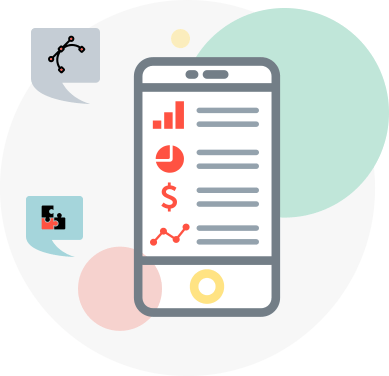
In-app search is one of the most useful, yet often overlooked feature in apps. A large number of users come to an app looking for something specific and the app must get them to the right result in minimum possible time.
After successfully getting your users on-board and helping them navigate easily through your site, it is now a good idea to make your app high on visual appeal. Everyone likes beautiful things and when designing your app, you have the time and freedom to create something beautiful of your own.
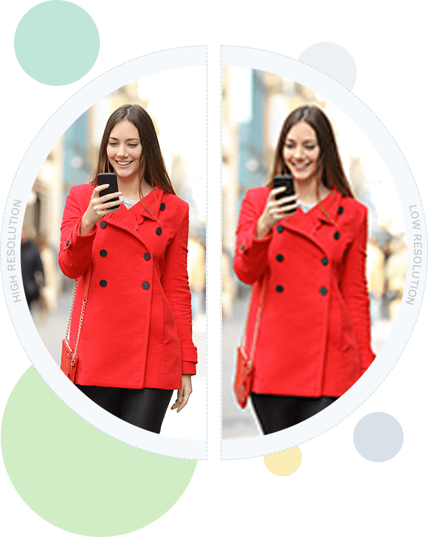
Using high-resolution images and graphics is the first step to increasing your app’s visual appeal. Rich vibrant colors, crystal clear product photos, pleasing background images are all a part of the scheme.
Beauty and functionality can go together well. It’s just important to strike a fine balancing act. It is crucial that you use high-resolution images on the app that don’t blur upon zooming.
At the same time, it is noteworthy that very high-resolution images tend to be heavy and take much time to load, which can be a pitfall. So be careful to choose pictures that are high in quality, yet lightweight and quick loading. Resizing images to fit the screen is a good way to achieve this.
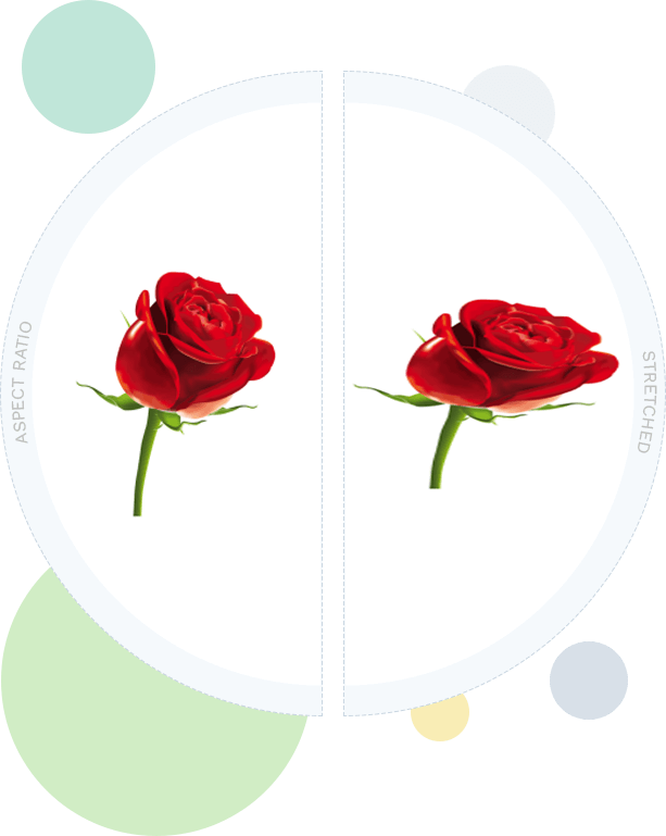
This may seem obvious, but images must always be used in the right aspect ratio so they don’t appear distorted. In simple terms, aspect ratio is the ratio of the height and width of an image. Images that are stretched too wide or too long just to fit into a space look unappealing and out of place. This is considered an amateur step and can lead to users taking your app for granted.
A good understanding of aspect ratios is especially significant in responsive app design because your app must adapt to different screen sizes, from 4 inches (yes, there still are people using these phones!) to 6 inches, 7 inches and 10 inches (tablets) to even smaller screens on wearables, which are quite the future of personal devices. Using a good aspect ratio will make sure the app opens effectively across any device with any screen size.
It is also a good idea to align images with the font and wrap text around images wherever necessary, so it’s easy to identify the context in which the image is being used.
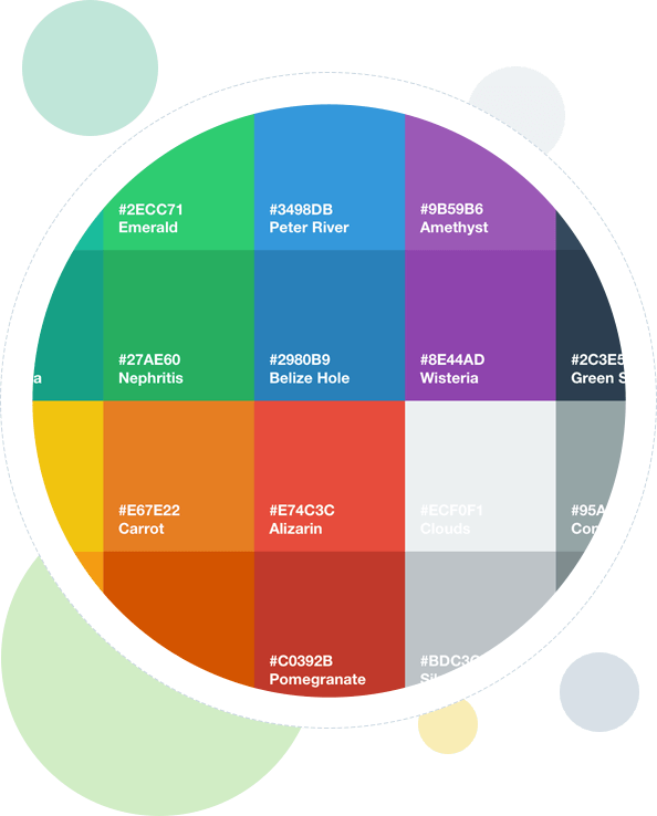
Color is more than just for visual appeal. In fact, color is one of the most important aspects of UI design. The right color palette can help guide your users seamlessly across pages and reinforce your branding. Your app’s color palette must be consistent with your branding.
One important thing to consider when deciding your app’s color palette is your target audience. If your app is targeted at a large number of different kinds of people, such as a social media or social sharing app, a vibrant, multicolour color palette will help you appeal to all kinds of people, no matter what their age, preferences or sensibility. For a corporate B2B app on the other hand, you may want to stick to one or two primary colors, and maintain a degree of business-like environment on your app.
It is vital to define proportions for the usage of different colors in advance. The primary color may for instance take up 40% to 60% space and the secondary colors may take 10% to 30% space as per pre-defined proportions. The color palette of the app must be consistent with the color scheme of the website too (if there is one) so that users who like to switch between devices, have a seamless experience.
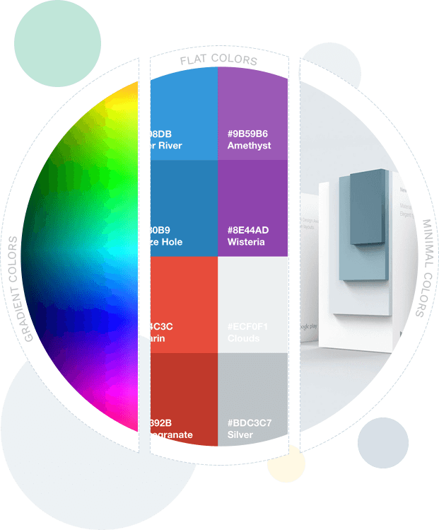
Design trends for apps and UI are constantly evolving and designers must keep pace with the changing user preferences. Material Design that was introduced by Google in 2014 has remained a popular choice among users and designers alike all through 2016 and the trend is likely to continue across 2017.
The success of Material Design is quite understandable as it is based on the principles of Flat Design that do away with earlier styles that involved 3D icons, shadows and gradients and instead adhere to a minimal, straightforward design that clearly displays icons and does not add to visual clutter. Some of the most popular apps like Google Now, Evernote, Lyft, QuickPic and Tumblr all use the Material Design now.
The introduction of iOS 10, Apple’s biggest release ever, also brought with it some new trends and systems. In keeping with the trend of using cards, these too are similar to Material Design. Apple apps like Music and News keep their interface minimal with use of grids and cards.
Adaptive Layout has taken precedence in interface design to accommodate all devices of different sizes. This greatly assists in creating a seamless user experience for people who use multiple devices. Apple also introduced the San Francisco Font in 2016 and the same remains the preferred font this year too.
High resolution images are one of the most powerful visual tools for an engaging app experience. However, rich graphics can get heavy and eat into your load time. Compressing images may sound like an option but can only work to an extent after which the image quality begins to fall. Designers need to play a careful balancing act to make sure an app has high quality images and still loads swiftly.
One of the best ways to do this is by making use of image slicing. This way, the image can load one piece at a time until it fully appears on the screen, keeping users engaged. This can be easily done using tools like Photoshop and Sketch.
With the ever increasing diversity in screen sizes, designers must pay close attention to image resolution and screen density to support multiple screens. Apple devices use a coordinate system measured in pixels, where a standard image is 1x and larger images are accordingly 2x and 3x. You can find a detailed guide here.
Android, a platform that supports an even wider range of screens has a set of six generalized screen sizes. The LDPI which is at the low end of the spectrum measures 120dpi, followed by MDPI, HDPI, XHDPI, XXHDPI and XXXHDPI.
Having done the slicing, you can then use prototyping tools like InVision and Zeplin to help communicate this design between the developer and the client.
InVision helps you present your designs to the client more effectively by creating interactive mockups that mimic the live app experience, creating a stronger impact than PDF files or screenshots. The inbuilt feedback integration allows everyone on board to leave comments and have discussions right within the app for a seamless review process. It lets you add gestures, animations and transitions as
Zeplin is another handy tool for design integration and collaboration for designers and developers. You can upload your Sketch prototype and Zeplin prepares your specs in no time, keeping layers and slices intact. It also has a fantastic guideline dashboard that allows you to keep your color palette
A good design is the perfect mix of beauty and functionality, and that is what you should be aiming for when building an app. A crisp on-boarding flow that kick-starts a user’s journey on your app to easy navigation and seamless conversions, transition to each of these steps should be intuitive and smooth to provide a great user experience. Delivering quality results and looking good when doing so are the only ways to increase engagement and retention, and a good design helps you achieve just that.
Source: Lookout app, Soasta, think with Google, Litely, Amazon Prime Video, Pexels, Clear Todos, Thumbs Vs. Touchscreens, Pinterest, Google, Freepngimg, Flatuicolors, Google - Material Design
Everything you’ll ever need to secure your app from every possible threat
An infographic detailing your journey from an idea to a complete app.